| |
We all like to think that we have the perfect website. Some of us do, but perfection is a rare commodity. Really good websites are "created" with the idea in mind that the viewer should never me made to think. The rule is: "Never, ever make the viewer have to think." Why? The moment they do is the short countdown for them go elsewhere. Viewers are not stupid - remember that. But, with all the websites that exist and the myriad number of ways that they are organized, confusion, instant meltdown and a quick departure will occur if one, some or all of the following characteristics are found on your website. Remember that about 85% of all B&B/Inn websites have one or more of the following problems. Be honest with yourself, do you have any or all of these problems?
- Color. Most websites have a background color of blue, pink or some other hue. Surprisingly, some major B&B directories also have this problem. Don’t do it! Pages should have a white base or background. It makes for easier viewing and less strain. For easiest viewing, web pages should never be more than 30% saturated. Some say even less than that. Lower saturation (i.e. page content as opposed to white space) is easier on the viewer and makes staying on a given web page all the more likely. Busy pages (ones with too many different concepts or messages to absorb) are irritating and are a bad sell. Get rid of them and make the vist to your website relaxing and inviting. Think of it, your potential client is trying to escape busyness and clutter!
- Contact information. Unfortunately, most websites effectively “hide” their contact information. Have it right there for the viewer to see. It invites them to call you immediately. Never, never, never make them look for it. Have it placed so that they see it immediately when your website HomePage comes up and have it accessable from every other page as well. Be absolutely sure, however, that it is not written out in “text,” but is placed on the page as a graphic (either .gif or .jpg). Why? Bulk spammers collect such information with spiders that can see only the "text" but can not see the "graphic." By using a graphic you will be visible to only your potential customer and invisible to the spammer's spiders. This is a wonderful trick against the spammers!
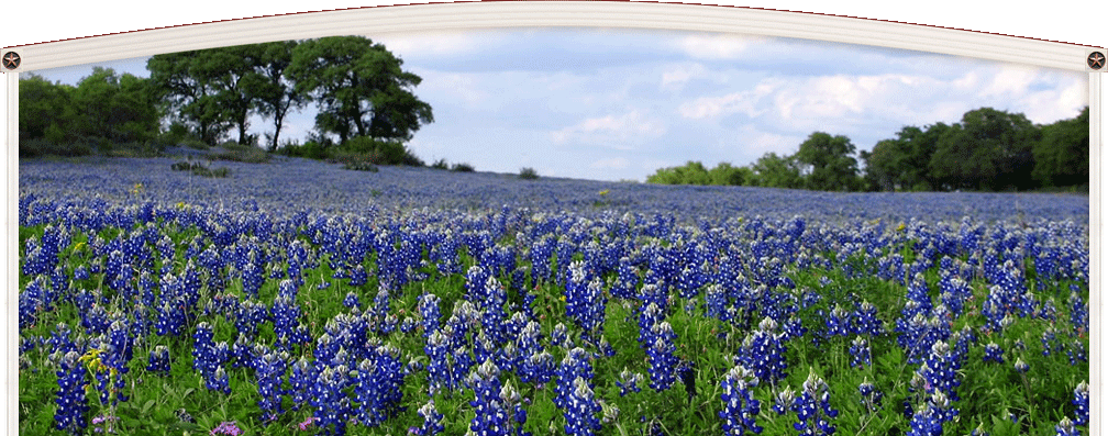
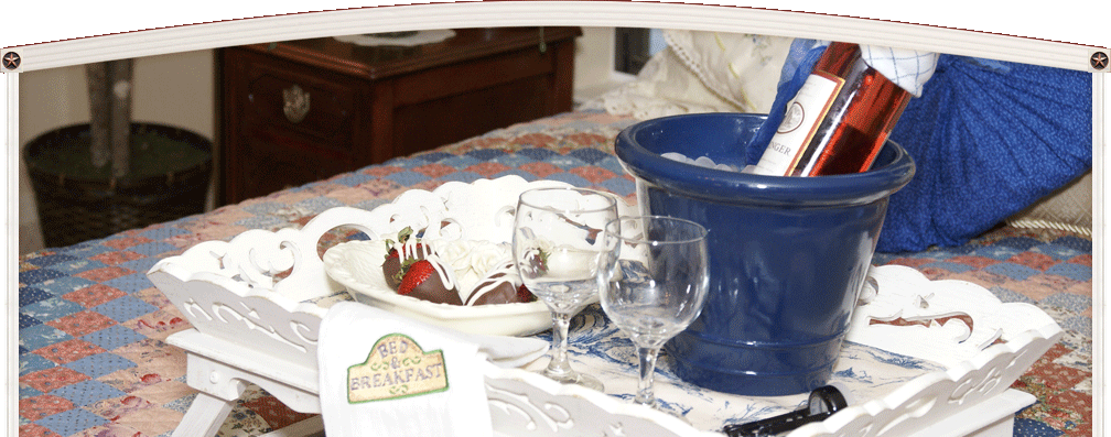
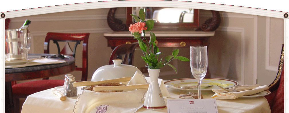
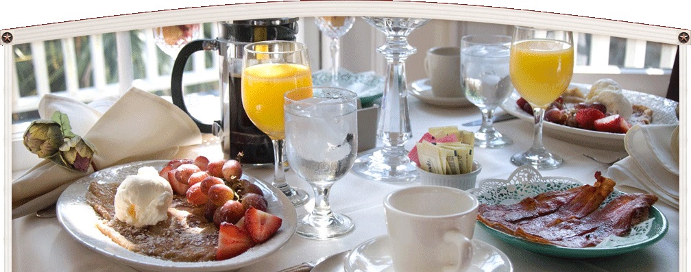
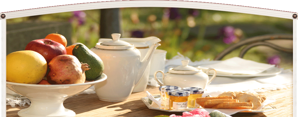
- Food. Food sells! Always have food displayed in a least one spot on your website. It is better that there be about 3 pictures but no more. Don’t overdo it. You are not a bakery - at least not most B&B/Inns. Let their mouth's water over what you can give them. It’s a powerful sales tool! Another important graphic is flowers. The floral or garden image sends a message that you care about your property, suggests that you maintain your property well and are of a mind that appreciates a tasteful atmosphere.
- Brochure. A brochure is not really necessary these days to mail out to prospective clients but a downloadable brochure that can be printed out on their personal printer is far more important than you think. When a potential client sees that your website provides something tangible to take away from their website visit, it is a tremendous value. Usually they will show that “downloaded” brochure to friends and others and will tend to reinforce their decision to visit you, to say nothing of the free advertizing that you will get. The brochure should be in color. Don’t worry about the cost, the client is using their ink not yours.
- Links to area attractions. So many fail to do this and it’s a big mistake. Having this is a huge time saver for your potential guests. Having area links says to them that in choosing you that they will be in the center of what they want to do and that you do want them to have a good experience. Just as important, you have helped them resolve an unconscious problem of what to do. They like this very much and it makes it all the more likely that they will book with you!
- Communications. In this day of cellphones we can overlook a very subtle necessity that will help strengthen repeat business - web access. For the most part your guests are business people. They may not say it outright - especially if they are on vacation - but they crave access to the internet. These “Road Warriors” usually are itchy just for a few minutes peek at what is happening to their business etc. - even on the weekends. Having access, and making it very, very clear that you have it, will sway many potential guests. This writer craves peace and quiet but avoids accommodations that do not have good internet access. The best access is WiFi.
- Availability. This is one of the biggest mistakes of a B&B website. Once the visitor is at your site, tell them that you are available for the dates they want. You don’t have to have a formal reservations system to do this. All you have to do is have a calendar that is color coded that shows when you are lightly, moderately or fully booked. Work with your webmaster to provide you with this ability. It is not hard to do. Seeing the availability, it will take just moments to look at the readily available contact information, give you a quick call and wrap things up. The potential visitor just wants to get things done and out of the way. Help them do it and the business is yours! If they can see that you are full - great. You would not have gotten the business anyway and they'll know better to look at your website sooner next time.
|